Tired of staring at spreadsheets that feel more like riddles than reports? You’re not alone. The right business intelligence dashboard can transform a confusing mess of data into your company’s most powerful strategic asset, revealing insights that were previously hidden in plain sight. But with so many options out there, finding the perfect design inspiration can feel like searching for a needle in a digital haystack.
This guide cuts through the noise. We’ve compiled a definitive list of the best business intelligence dashboard examples to spark your creativity and guide your design process. Forget generic templates; we’re diving deep into real-world dashboards from platforms like Tableau, Power BI, and Zoho Analytics. For each example, we’ll break down exactly what makes it effective, highlighting specific features, replicable strategies, and actionable takeaways you can implement immediately.
You’ll see how different industries visualize critical KPIs and track performance. To see how these concepts translate into practice, you can explore compelling financial dashboard examples that demonstrate their power in modern banking. Our goal is to give you a visual playbook, complete with screenshots and direct links, so you can stop guessing and start building a dashboard that drives real business results.
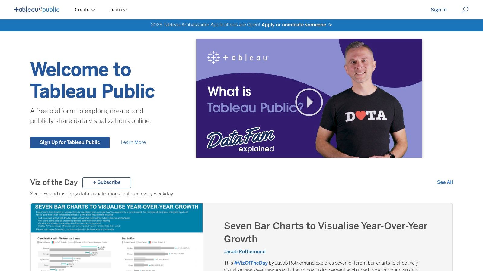
1. Tableau Public Gallery
Think of Tableau Public Gallery as the ultimate show-and-tell for data visualization. It’s not just a collection of static images; it’s a massive, interactive library where the global Tableau community shares its creations. This platform is a treasure trove of business intelligence dashboard examples, offering a deep dive into what’s possible with modern BI tools. For anyone from a startup founder to a Fortune 500 executive, this is the place to get inspired and see real-world data stories in action.
The gallery’s biggest draw is its sheer diversity. You can find dashboards analyzing everything from global supply chains and financial market trends to sports analytics and public health data. It’s an invaluable free resource for seeing how others tackle complex data challenges.
Strategic Analysis
What makes Tableau Public Gallery a must-visit is its function as both an inspiration hub and a practical learning tool. Users don’t just view the dashboards; they can often download the underlying Tableau workbooks. This “look under the hood” approach is a game-changer for learning.
Key Takeaway: The ability to deconstruct professional-grade dashboards provides a direct path to replicating advanced techniques. You can see the exact calculations, data connections, and design choices the creator made, offering an unparalleled learning experience.
The platform is completely free to access and browse. However, to download and interact with the workbooks, you’ll need a copy of Tableau Desktop or the free Tableau Public application. The user interface is clean and discovery-focused, with categories like “Viz of the Day” to highlight exceptional work.
Actionable Insights
To get the most out of the Gallery, use it with a specific goal in mind.
For Inspiration: Filter by industry or topic to see how peers are visualizing relevant KPIs. Search for “sales dashboard” or “marketing analytics” to find targeted examples.
For Technical Skill-Building: Find a dashboard that uses a chart type or feature you want to master. Download the workbook and reverse-engineer its construction.
For Design Best Practices: Pay attention to color theory, layout, and font choices in the “Featured” or “Viz of the Day” sections. These often represent the gold standard in data visualization design.
Feature
Benefit for Your Business
Community-Generated Content
Access a constant stream of fresh, innovative dashboard ideas.
Downloadable Workbooks
Accelerate your team’s learning curve by deconstructing expert-level work.
Diverse Industry Examples
Find relevant examples to solve specific business problems in your sector.
If Tableau is the art gallery, think of the Power BI Community Gallery as the collaborative workshop. This is where Microsoft’s massive user base comes together to share, critique, and improve their data stories. It’s a fantastic, hands-on resource packed with business intelligence dashboard examples that solve real-world problems. For any organization embedded in the Microsoft ecosystem, this gallery is the go-to place for practical inspiration and downloadable templates.
The gallery’s strength lies in its direct connection to a vibrant community. You won’t just find dashboards; you’ll find the discussions, questions, and solutions that went into building them. This makes it an ideal spot to see how others are leveraging the full Power BI suite to drive business decisions.
Strategic Analysis
The Power BI Community Gallery serves as both a showcase and an open-source learning environment. Its unique value comes from the ability to download the actual Power BI (.PBIX) files. This allows your team to go beyond simply viewing a dashboard and start actively adapting it for your own business needs, saving significant development time.
Key Takeaway: The gallery is a launchpad, not just a library. By providing downloadable templates, it enables businesses to skip the “blank page” problem and start with a functional, community-vetted dashboard foundation.
Access to browse the gallery is completely free. To download and customize the .PBIX files, you will need a version of Power BI Desktop, which is also free. The platform’s interface is straightforward, organized like a forum, which encourages interaction and makes it easy to find both the dashboards and the conversations surrounding them.
Actionable Insights
To leverage the gallery effectively, approach it with a problem-solving mindset.
For Template Sourcing: Instead of building from scratch, search for keywords like “HR analytics” or “inventory management” to find a pre-built dashboard you can adapt.
For Technical Solutions: Having trouble with a specific DAX formula or data model? Look for dashboards that solve a similar problem and examine their underlying structure.
For Community Feedback: Share your own work-in-progress to get feedback from experienced Power BI users and Microsoft MVPs who frequent the forum.
Feature
Benefit for Your Business
Downloadable .PBIX Files
Drastically reduce development time by starting with a pre-built template.
Active User Community
Get answers to technical questions and learn from real-world user experiences.
Practical, Business-Focused Examples
Find dashboards designed to solve common operational challenges.
If you’re looking for a practical, get-it-done-now solution without a steep learning curve, Zoho Analytics is your starting point. It excels by offering a massive library of over 250 pre-built dashboards and reports tailored for specific business functions like sales, marketing, and finance. This makes it one of the most accessible sources of business intelligence dashboard examples for small to medium businesses that need to get up and running quickly.
The platform’s strength lies in its plug-and-play nature. Instead of building from scratch, you connect your data source (like Salesforce, QuickBooks, or Google Analytics), and Zoho populates a professionally designed, interactive dashboard for you in minutes. It’s an incredible accelerator for teams without a dedicated data analyst.
Strategic Analysis
Zoho Analytics’ primary value proposition is speed to insight. Where other tools offer a blank canvas, Zoho provides a structured, best-practice template. This approach removes the guesswork and ensures your first dashboard is both functional and insightful from day one.
Key Takeaway: Using pre-built templates allows your team to focus on analyzing data rather than designing dashboards. This is especially critical for small business data analytics where resources are limited and immediate ROI is essential.
Zoho Analytics offers a free plan for two users, and its paid plans are known for being affordable. The user interface is clean and intuitive, designed for business users, not just data scientists. While it integrates with dozens of popular business apps, its seamless connection with the broader Zoho software ecosystem is a major advantage for existing Zoho customers.
Actionable Insights
To maximize the value of Zoho Analytics, leverage its pre-built templates as a foundation.
For Rapid Deployment: Connect a primary data source like your CRM or accounting software. Use the auto-generated dashboard as your initial single source of truth for that department.
For Customization Practice: Start with a pre-built template that closely matches your needs, then use the drag-and-drop editor to swap out a KPI, change a chart type, or adjust the color scheme. This is a low-risk way to learn the platform.
For Cross-Functional Reporting: Use Zoho’s blending capabilities to combine data from different sources, such as merging marketing campaign costs from Google Ads with sales revenue from your CRM to calculate ROI.
Feature
Benefit for Your Business
Pre-Built Dashboard Templates
Deploy functional, best-practice dashboards in minutes, not weeks.
User-Friendly Interface
Empower non-technical team members to build and analyze reports.
Affordable Pricing
Access powerful BI capabilities without a significant enterprise-level investment.
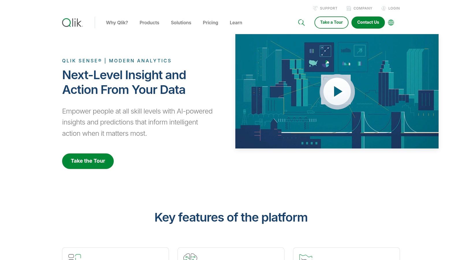
Qlik Sense stands out with its powerful associative engine, which goes beyond typical query-based BI tools. Instead of linear, pre-defined drill-downs, Qlik’s platform allows users to explore data in any direction, uncovering hidden relationships and insights that might otherwise be missed. This makes its collection of business intelligence dashboard examples a showcase for deep, intuitive data discovery rather than just static reporting. For businesses that need to understand not just what happened, but why, Qlik provides the analytical firepower.
The platform is designed to handle massive datasets with speed, making it a favorite in enterprise environments dealing with complex data from multiple sources. The dashboards are interactive and fully responsive, ensuring a consistent and effective user experience across all devices, from desktops to tablets.
Strategic Analysis
The core differentiator for Qlik Sense is its associative data model. While other tools show you data related to your selections, Qlik uniquely highlights data that is unrelated. This “power of gray” immediately draws your attention to what’s been left out of your query, often leading to the most profound discoveries and preventing you from making decisions based on an incomplete picture.
Key Takeaway: Qlik’s associative engine encourages true data exploration. By revealing both related and unrelated data points, it empowers users to ask new questions and follow their curiosity to uncover unexpected correlations, driving more robust and informed strategies.
While Qlik offers a powerful suite of tools, it comes with a steeper learning curve and a higher price point compared to some competitors. It offers a free trial, but full deployment requires a subscription, with pricing tailored to business needs through cloud and on-premise options. The platform has a strong community and extensive support resources to help users master its capabilities.
Actionable Insights
To leverage Qlik Sense effectively, focus on its exploratory strengths.
For Deep Analytics: Instead of building dashboards with a fixed path, design them to encourage exploration. Use its associative model to let users freely click and filter to uncover their own insights.
For Data Governance: Use Qlik to combine disparate data sources into a single, governed application. This allows business users to explore freely within a secure and accurate data environment.
For Training: Pay close attention to the “gray” or unselected data during analysis sessions. Train your team to investigate these areas to challenge assumptions and discover hidden patterns.
Feature
Benefit for Your Business
Associative Data Model
Uncover hidden insights by seeing how all your data is related, not just a subset.
Interactive & Responsive Dashboards
Enable data-driven decision-making for your entire team, anywhere, on any device.
Handles Large Datasets
Analyze comprehensive, enterprise-level data without sacrificing performance or speed.
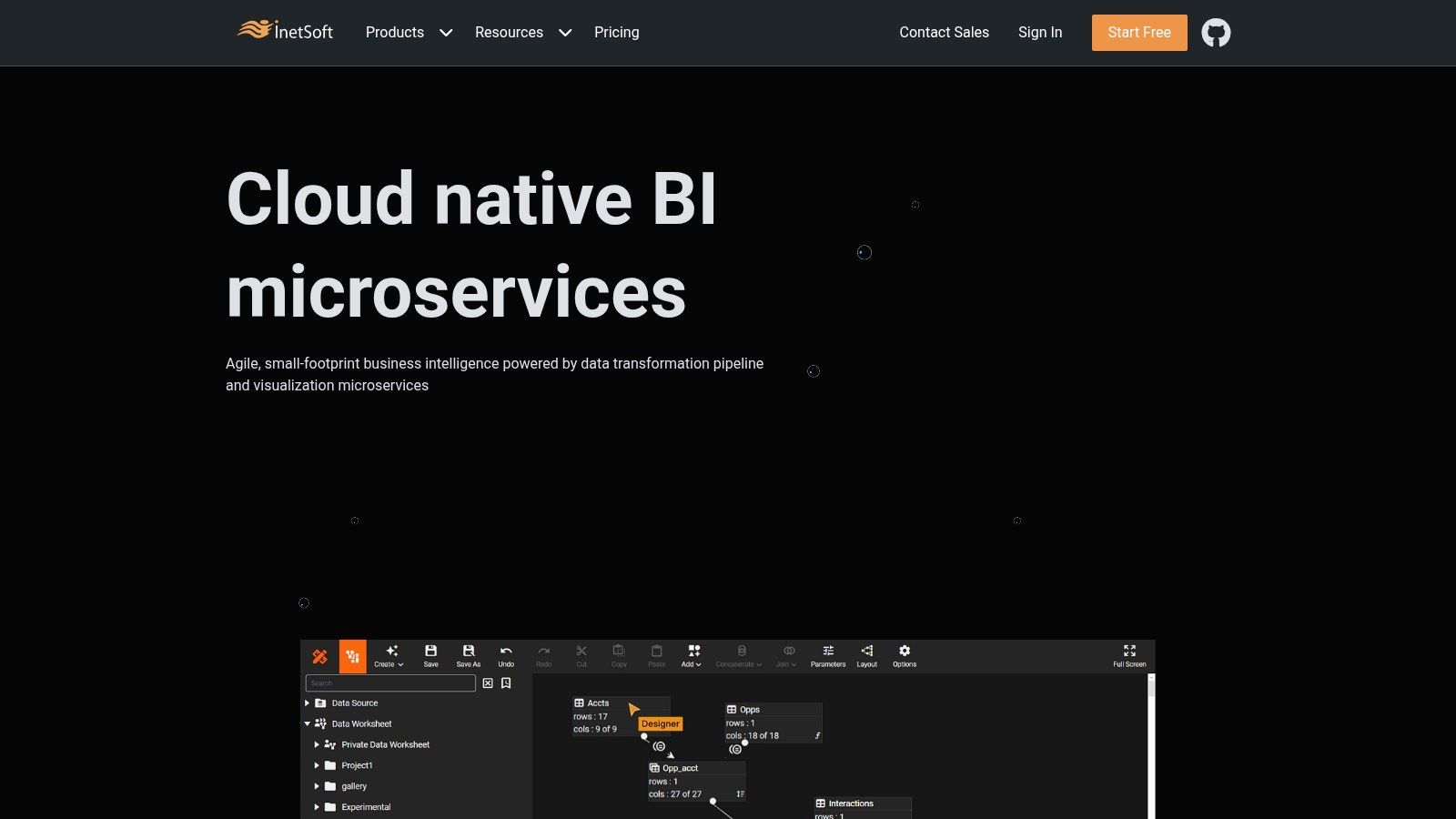
InetSoft Technology offers a more traditional, enterprise-focused approach to BI. Their platform, Style Intelligence, provides a gallery of business intelligence dashboard examples that showcase its power in handling complex, real-time data streams. This is less of a community showcase and more of a direct demonstration of what their specific tool can accomplish, making it ideal for businesses evaluating scalable BI solutions.
The examples on their site cover a wide range of industries, from healthcare and insurance to logistics and finance. While the user interface might appear less modern than some competitors, the platform’s strength lies in its robust data mashing and real-time visualization capabilities. For an in-depth look at how their platform fits into a broader strategy, you can learn more about their analytic data solutions.
Strategic Analysis
InetSoft’s primary value proposition is its ability to create highly interactive, customized dashboards tailored to specific business needs. Unlike open platforms, their examples are designed to sell you on their software, meaning they highlight features that solve concrete business problems, like real-time inventory tracking or financial performance monitoring.
Key Takeaway: InetSoft excels at demonstrating practical, function-specific dashboards. This is the place to see how a single, integrated platform can serve multiple departments with tailored visualizations, all drawing from a unified data source.
Access to view the examples on their website is free. However, to build or implement these dashboards, you would need to license their Style Intelligence software. Their business model is built around providing comprehensive support and training, which is a key differentiator for organizations that need a more hands-on implementation partner.
Actionable Insights
Use InetSoft’s examples as a blueprint for function-specific dashboards within your own organization.
For Departmental Solutions: Browse their industry-specific examples to see how they structure dashboards for roles like CFOs, supply chain managers, or sales directors.
For Real-Time Monitoring: Pay close attention to their dashboards that emphasize live data. Analyze how they use gauges, tickers, and auto-refreshing charts to convey urgency and immediacy.
For Feature Evaluation: If you’re considering InetSoft as a vendor, use their gallery to assess if their visualization types and interactive features meet your technical requirements.
Feature
Benefit for Your Business
Real-Time Data Processing
Enables proactive decision-making based on the most current information.
Scalable Architecture
Ensures the BI solution can grow with your company, from a small team to an enterprise.
Customizable Dashboards
Allows for the creation of tailored views that align perfectly with specific job roles and KPIs.
Think of Hevo Data’s collection as a guided tour through the world of Power BI. Instead of a vast, unfiltered gallery, Hevo provides a curated list of high-impact business intelligence dashboard examples, each one handpicked to illustrate a specific business function. This resource is perfect for managers and analysts who need targeted inspiration for their own reporting without getting lost in an ocean of options.
The real value here is the context provided. Each dashboard example comes with a detailed breakdown of its purpose, the key metrics it tracks, and why it’s effective. This makes it an excellent learning resource for teams just starting their business intelligence journey or those looking to refine their existing dashboards.
Strategic Analysis
Hevo’s approach is less about creative exploration and more about practical application. By focusing exclusively on Power BI, they offer deep, platform-specific insights. The strength lies in the detailed explanations that accompany each visual example, which act as a blueprint for building effective dashboards.
Key Takeaway: The platform excels at translating a visual dashboard into a strategic business tool. It connects the dots between a chart and the business question it answers, fostering a deeper understanding of data-driven decision-making.
Access to the article and all the examples is completely free. The user experience is straightforward, presented as a blog post, making it easy to scroll and absorb the information. While you can’t download templates, the detailed guidance provides a clear path to recreating the dashboards in your own Power BI environment.
Actionable Insights
Use Hevo’s list to bridge the gap between theory and execution for your BI projects.
For Functional Guidance: If you need to build a finance or sales dashboard, go directly to their examples. Read the analysis to understand which KPIs are non-negotiable for that department.
For Best Practice Education: Use their descriptions to train your team on the “why” behind dashboard design. Focus on how each element serves a specific analytical purpose.
For Project Scoping: Before building a new dashboard, review a relevant Hevo example to create a clear project brief, outlining the key metrics and goals from the start.
Feature
Benefit for Your Business
Curated Power BI Examples
Get focused, high-quality inspiration specific to the Power BI platform.
Detailed Metric Explanations
Understand the strategic importance of each KPI, not just its visual representation.
Use-Case-Specific Content
Quickly find relevant examples for core business functions like sales, finance, and marketing.
DataCamp takes a unique, educational approach to business intelligence dashboard examples. Instead of just showcasing finished products, it integrates them directly into a learning ecosystem. This platform is less of a gallery and more of a hands-on workshop, designed to not only show you what a great dashboard looks like but to teach you how to build it yourself, primarily using Power BI. It’s an ideal resource for teams looking to upskill and individuals aiming to master the art of data visualization.
The platform presents a curated selection of dashboards for various business functions like sales, HR, and marketing. Each example is accompanied by detailed explanations of its components, KPIs, and the strategic thinking behind its design, making it an incredibly rich learning tool.
Strategic Analysis
What sets DataCamp apart is its direct link between inspiration and execution. You see a dashboard, and then you’re immediately offered an interactive course to learn the exact skills needed to create it. This closes the common gap between seeing a great example and having the technical ability to replicate it.
Key Takeaway: The platform’s strength lies in its integrated learning model. By combining theory with interactive practice, it empowers users to move from passive observation to active creation, ensuring the lessons stick.
Access to the dashboard examples and some introductory content is free, but the real value comes from the subscription-based model that unlocks the full catalog of interactive courses. The user experience is clean and education-focused, guiding users along a clear learning path from basic concepts to advanced dashboard development.
Actionable Insights
To leverage DataCamp effectively, align your browsing with your team’s specific learning objectives.
For Skill Development: Identify a dashboard that aligns with a business need. Enroll in the associated Power BI track to systematically build the skills to create a similar, customized version for your organization.
For Foundational Knowledge: Before diving into complex BI tools, ensure your team has a solid base. Mastering fundamental concepts is key, and learning how to analyze data in Excel provides a practical foundation for understanding the logic behind dashboard metrics.
For Team Training: Use DataCamp’s business plans to create customized learning paths for your data team, using the dashboard examples as a final project goal.
Feature
Benefit for Your Business
Integrated Interactive Courses
Turns dashboard inspiration into an actionable training program, raising your team’s BI skill level.
Component Explanations
Demystifies dashboard design by breaking down the “why” behind each chart and metric choice.
Focus on Power BI
Provides deep, specialized training for one of the most widely used BI tools in the corporate world.
Business Intelligence Dashboard Examples Comparison
Platform
🔄 Implementation Complexity
⚡ Resource Requirements
📊 Expected Outcomes
💡 Ideal Use Cases
⭐ Key Advantages
Tableau Public Gallery
Moderate – dashboards vary by creator
Requires Tableau software for full use
Access to diverse interactive dashboards
Exploring real-world BI examples
Free, high-quality user-generated content
Power BI Community Gallery
Moderate – templates vary in complexity
Requires Power BI software
Practical BI dashboards and templates
Community-supported Power BI learning
Active user community and frequent updates
Zoho Analytics
Low to Moderate – user-friendly interface
Affordable pricing, integration needed
Customizable dashboards across domains
Small to medium businesses requiring ease of use
Easy to use, good documentation, affordable
Qlik Sense
High – steep learning curve
Higher cost, supports large datasets
Deep analytics with flexible deployment
Enterprises needing advanced data exploration
Powerful data integration and flexible deployment
InetSoft Technology
Moderate to High – customizable solutions
Supports scalable deployments
Real-time, interactive dashboards
Businesses needing real-time BI insights
Real-time data focus and strong support
Hevo Data
Low – guided insight-focused examples
No software required to view examples
Actionable insights from Power BI dashboards
Learning Power BI with practical examples
Clear explanations and best practice focus
DataCamp
Moderate – learning integrated with examples
Subscription needed for full course access
Improved BI visualization skills
Users seeking structured learning paths
Combines examples with interactive courses
From Inspiration to Implementation: Your Next Steps
We’ve journeyed through a diverse landscape of powerful business intelligence dashboard examples, from the community-driven galleries of Tableau and Power BI to specialized platforms like Zoho Analytics and Qlik Sense. Each example wasn’t just a pretty picture; it was a strategic blueprint for turning raw data into decisive action. The key takeaway is clear: the best dashboards are more than just data visualizers, they are storytellers, problem-solvers, and growth engines.
Throughout this guide, we’ve seen how effective dashboards achieve a delicate balance. They blend high-level executive summaries with granular, drill-down details, cater to specific user roles, and prioritize clarity over complexity. The most impactful designs go beyond simply presenting what happened and help you understand why it happened and what you should do next.
Your Action Plan for Building a Better Dashboard
Feeling inspired? Great. Now it’s time to channel that inspiration into implementation. Here’s a simple, actionable roadmap to get you started on creating or improving your own business intelligence dashboards.
Define Your “Why”: Before you touch any tool, pinpoint the single most important business question you need to answer. Is it improving customer retention, optimizing marketing spend, or streamlining supply chain logistics? A clear objective is your north star.
Identify Your Audience: Who is this dashboard for? An executive needs a 30,000-foot view of KPIs, while an operations manager needs real-time alerts on production line performance. Design for their needs, not for a generic user.
Choose the Right Metrics: Don’t fall into the trap of tracking everything. Select a handful of key performance indicators (KPIs) that directly align with the business question you defined in step one. Less is almost always more.
Selecting the Right Tools and Integrating Your Data
Choosing the right BI tool is a critical step. If you’re looking for vast community support and creative freedom, Tableau or Power BI are fantastic starting points. For a more integrated, all-in-one business suite, Zoho Analytics shines. The key is to evaluate each platform based on your team’s technical skills, budget, and specific integration needs.
Remember, a dashboard is only as reliable as the data that feeds it. Flawless visualization means nothing if your data is messy, siloed, or inconsistent. To truly unlock the power of your business intelligence dashboards and derive meaningful insights, it’s crucial to master the data integration process, ensuring data flows seamlessly and accurately from all sources. A solid data foundation is non-negotiable for building trust and making confident decisions.
Ultimately, the journey from a static spreadsheet to an interactive, insightful dashboard is transformative. It’s about empowering your team with the clarity to make smarter, faster decisions. Use the business intelligence dashboard examples we’ve explored as your inspiration, apply these strategic principles, and start building the tools that will drive your business forward.
Ready to move beyond inspiration and build custom BI solutions that perfectly match your unique business challenges? The team at NILG.AI specializes in developing bespoke AI and data intelligence platforms that turn your data into a competitive advantage. Visit NILG.AI to see how our tailored solutions can accelerate your data-driven journey.
Special offers, latest news and quality content in your inbox.
Signup single post
Recommended Articles
Article
AI for Business Growth Your Practical Strategy Guide
Jun 17, 2026 in
Guide: Explainer
Discover how AI for business growth can boost efficiency, improve decision-making, and create deeper customer connections. Get actionable strategies now.
We use cookies on our website to give you the most relevant experience by remembering your preferences and repeat visits. By clicking “Accept All”, you consent to the use of ALL the cookies. However, you may visit "Cookie Settings" to provide a controlled consent.
This website uses cookies to improve your experience while you navigate through the website. Out of these, the cookies that are categorized as necessary are stored on your browser as they are essential for the working of basic functionalities of the website. We also use third-party cookies that help us analyze and understand how you use this website. These cookies will be stored in your browser only with your consent. You also have the option to opt-out of these cookies. But opting out of some of these cookies may affect your browsing experience.
Necessary cookies are absolutely essential for the website to function properly. These cookies ensure basic functionalities and security features of the website, anonymously.
Cookie
Duration
Description
cookielawinfo-checkbox-analytics
11 months
This cookie is set by GDPR Cookie Consent plugin. The cookie is used to store the user consent for the cookies in the category "Analytics".
cookielawinfo-checkbox-functional
11 months
The cookie is set by GDPR cookie consent to record the user consent for the cookies in the category "Functional".
cookielawinfo-checkbox-necessary
11 months
This cookie is set by GDPR Cookie Consent plugin. The cookies is used to store the user consent for the cookies in the category "Necessary".
cookielawinfo-checkbox-others
11 months
This cookie is set by GDPR Cookie Consent plugin. The cookie is used to store the user consent for the cookies in the category "Other.
cookielawinfo-checkbox-performance
11 months
This cookie is set by GDPR Cookie Consent plugin. The cookie is used to store the user consent for the cookies in the category "Performance".
viewed_cookie_policy
11 months
The cookie is set by the GDPR Cookie Consent plugin and is used to store whether or not user has consented to the use of cookies. It does not store any personal data.
Functional cookies help to perform certain functionalities like sharing the content of the website on social media platforms, collect feedbacks, and other third-party features.
Performance cookies are used to understand and analyze the key performance indexes of the website which helps in delivering a better user experience for the visitors.
Analytical cookies are used to understand how visitors interact with the website. These cookies help provide information on metrics the number of visitors, bounce rate, traffic source, etc.
Advertisement cookies are used to provide visitors with relevant ads and marketing campaigns. These cookies track visitors across websites and collect information to provide customized ads.